Posted: 27 Aug 2011 10:22 PM PDT
Yves here. This short piece by Robert Gordon is important because it seeks to quantify the impact of a phenomenon that economists have noticed a bit late in the game: that the benefits of GDP growth, which used to go mainly to labor (via increased hiring and better wages) now benefit capitalists fare more than ordinary workers. The shift towards increases in GDP favoring corporate profits at the expense of labor became pronounced in the weak Bush expansion (we commented on it in a 2005 article) and Gordon’s effort to try to translate that into the impact on unemployment levels is a useful step forward in the debate. By Robert Gordon, Professor in the Social Sciences and Professor of Economics at Northwestern University. Cross posted from VoxEU
The US is missing millions of jobs. This column argues that the total is 10.4 million. It claims that 3 million of these can be traced to the weakened bargaining position of labour and the growing assertiveness of management in slashing costs to maintain share prices. Moreover, this employment gap is not shrinking because of the ‘double hangover’ effect—an excess housing supply and besieged consumers unwilling to spend.
High and persistent unemployment in the US has emerged as one of the most important macroeconomic legacies of the 2007-09 world economic crisis. While the decline of business activity in the US was no larger than in Europe, the US is an outlier in its outsized response of the unemployment rate to its decline of output (IMF 2011).
Here we quantify the shortfall of US employment – some 10.4 million missing jobs – and ask: Why did the number of jobs decline so much and why has it recovered so little? Two sets of causes stand out.
First, there has been a changing balance of economic power in the US between management and labour in the past two decades that has led to more aggressive firing of workers when business profits head south.By explaining why the recovery of aggregate demand has been so weak, we provide an understanding of the refusal of the large negative output gap to shrink – a refusal shared by its twin, the employment gap.
Second, the large negative output gap (actual real GDP below trend or potential) is not shrinking, due to the “double hangover” persisting in the aftermath of the housing bubble.
Dimensions of the job shortfall: 10.4 million missing jobs in the recovery
Part of the job shortfall is reflected in the rise of measured unemployment. The rest comes from a decline in labour-force participation. The employment-population ratio (hereafter E/P) measure combines the two.1 As shown in Figure 1, the ratio (as shown by the green line) was 64.3% at the NBER business-cycle peak in 2001:Q1. By the next peak (2007:Q4) it had fallen to 62.8% (blue line).
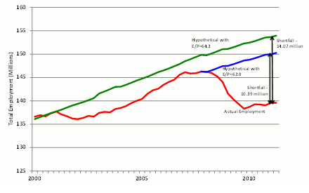
This descent from 64.3% to 62.8% led numerous commentators to lament that the 2001-07 US economic recovery was not a complete recovery. Indeed, the seemingly ‘minor’ 1.5% drop in the ratio represents more than 3.6 million ‘missing’ jobs – even before the recent recession.How many jobs are lacking? Figure 2 shows that the shortfall amounts to 10.4 million missing jobs compared to the 2007 version of normality and a much higher 14.1 million missing jobs compared to the 2001 definition. In the rest of this analysis, we take the less ambitious 2007 value for the ratio of 62.8% as the relevant benchmark.
In mid-2011, the ratio (wavering red line) is only 58.1% — far below 2001 and 2007 levels.
Figure 1. Actual vs two criteria of normal employment per capita, 2000:Q1-2011:Q2
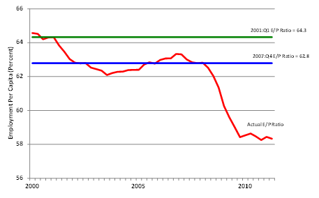
Figure 2. Actual vs hypothetical employment, 2000:Q1-2011:Q2
What caused the destruction of 10.4 million jobs?
The first explanation is the change in managerial power. For decades I have been tracking the responsiveness of labour-market variables to the output gap (see most recently Gordon, 2003, 2010).
Before the mid-1980s a 1% change in the output gap would generate roughly a response of 0.45% in the similarly defined gap of the Employment Population ratio.The observed ratios in the data for 1954-86 are roughly consistent with the predictions made by Arthur Okun (1962) in what soon became christened as “Okun’s Law.”
The rest of the 1% shortfall of real GDP would show up in declining productivity and in hours per employee.
After the mid-1980s, however, these responses changed in a process I have described as the “Demise of Okun’s Law.” The response of the ratio jumped from 0.45 in the 1954-86 interval to 0.78 in an otherwise identical regression equation applied to 1986-2011. This means that when output slumps, employment drops much more than it would have done previously.
The “disposable worker hypothesis”
When the economy begins to sink – like the Titanic after the iceberg struck – firms begin to cut costs any way they can; tossing employees overboard is the most direct way. For every worker tossed overboard in a sinking economy prior to 1986, about 1.5 are now tossed overboard. Why are firms so much more aggressive in cutting employment costs? My “disposable worker hypothesis” (Gordon, 2010) attributes this shift of behaviour to a complementary set of factors that amount to “workers are weak and management is strong.” The weakened bargaining position of workers is explained by the same set of four factors that underlie higher inequality among the bottom 90% of the American income distribution since the 1970s – weaker unions, a lower real minimum wage, competition from imports, and competition from low-skilled immigrants.
But the rise of inequality also has boosted the income share of the top 1% relative to the rest of the top 10%. In the 1990s corporate management values shifted toward more emphasis on shareholder value and executive compensation, with less importance placed on the welfare of workers, and a key driver of this change in attitudes was the sharply higher role of stock options in executive compensation. When stock market values plunged by 50% in 2000-02, corporate managers, seeing their compensation collapse with profits and the stock market, turned with all guns blazing to every type of costs, laying off employees in unprecedented numbers. This hypothesis was validated by Steven Oliner, Daniel Sichel, and Kevin Stiroh (2007), who showed using cross-sectional data that industries experiencing the steepest declines in profits in 2000-02 had the largest declines in employment and largest increases in productivity.
Why was employment cut by so much in 2008-09? Again, as in 2000-02, profits collapsed and the stock market fell by half. Beyond that was the psychological trauma of the crisis; fear was evident in risk spreads on junk bonds, and the market for many types of securities dried up. Firms naturally feared for their own survival and tossed many workers overboard.
3 million missing jobs due to altered management response to recession
Figure 3 provides the results of a simple experiment regarding the loss of jobs.
Labour-market responses to business-cycle shortfalls were quite different when estimated with regressions over the 1954-1986 (“early”) and 1986-2011 (“late”) sample periods.Given the decline in the output gap, simulated employment fell short by 9.82 million with the “late” dynamic adjustment behaviour, quite close to the 10.39 million actual shortfall. Yet with the “early” coefficients employment fell by a substantial but significantly smaller total of 6.72 million.
Responses of employment and other labour market variables were much larger in the “late” period (as predicted by the disposable worker hypothesis).
Figure 3. Actual vs hypothetical and dynamic simulation employment, 2007:Q4-2011:Q2
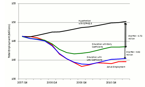
Thus labour’s weakened bargaining situation with changes in management behaviour toward greater emphasis on cost-cutting in recessions accounts for roughly 3 million lost jobs in the current jobless recovery. The other 6.72 million would have been lost even with the earlier responses because the output gap was so large.
Why is aggregate demand so weak? The ‘double hangover’ explanation
This explains the outsized job cuts that came in response to the recession. But we are still left with the question of explaining why the output gap is still so negative 2 years after the NBER business-cycle trough (June 2009).
America’s double hangover goes back to the consumption binge that accompanied the 2000-06 housing bubble.
The residential construction industry was building houses at a pace much higher than the underlying rate of household formation.Households could use not only their own income to buy consumer goods and services but could finance expenditures in excess of income through second mortgages and refinancing that allowed them to drain cash from their appreciating residences.
Housing demand was boosted by speculators who bought new condominiums hoping to “flip” them for easy profits and by mortgage brokers who were out combing the weeds for low-income families to whom they could peddle dangerous adjustable-rate interest-only mortgages.
Consumption of all types, particularly of durable goods like autos and appliances and services like nail salons and child tutoring, grew faster than income, implying an ever-declining personal saving rate.
Once the bubble burst and house prices began to tumble, the ‘double hangover’ began.
The first hangover was the excess supply of housing.This led to a glut of unsold houses and condos that put continuous downward pressure on home prices. Foreclosures added to the glut; each foreclosure raises the supply of vacant housing units by one unit while increasing the demand for housing units by zero, because the foreclosed family has by definition defaulted on its mortgage and cannot obtain credit for several years into the future. Many homeowners avoided foreclosure but were “underwater,” with houses now worth less than the face value of the mortgage and thus faced the hapless choice of draining resources to pay the mortgages or defaulting, with the consequence of a ruined credit rating.
The second hangover was the impact of excessive indebtedness.
Just as consumption could exceed income as debts were being run up, so the second hangover required consumption to be below income while debts were paid off. The ratio of total household indebtedness to personal disposable income rose from 90% in 1995 to 133% in 2007 and has since fallen just to 120%. Year after year of saving and underconsumption will continue as households continue to pay off debts.
Just as hangovers have negative impacts on family members and job performance, so the double hangover of the slump in residential housing investment and in personal consumption expenditures has spilled over to other components of GDP. Nonresidential investment was hit as firms supplying consumers and home builders reduced their need for new computers, machinery, factories, office buildings, and hotels. State and local governments, by law required to balance their current budgets, began to lay off school teachers and other employees.
Dissecting the shortfall of aggregate demand
We now turn to the “shortfall” of each component of aggregate demand.
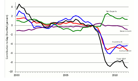
The shortfall is defined relative to the previous business-cycle peak in 2007:Q4, so if the ratio of a component of spending to potential GDP has declined by 3.0% between 2007:Q4 and 2011:Q2, we describe its shortfall as 3.0%.Figure 4 illustrates the gap shortfall relative to normal for total GDP and its four major spending components. The total gap shortfall is shown by the black line and is divided into the shortfall of consumption (red), investment (blue), government spending (purple), and net exports (green).
The sum of all these shortfalls adds up to the -9.2% output gap.
Consumption and investment are roughly tied in their contribution at about -5% of potential GDP,Notice that in 2000 and again in 2005-07 the total gap was positive rather than negative, and this was mainly attributable to a positive gap for equipment investment in 2000 and housing investment in 2005-07.
Government makes a small negative contribution; and
Net exports make a substantial positive contribution.
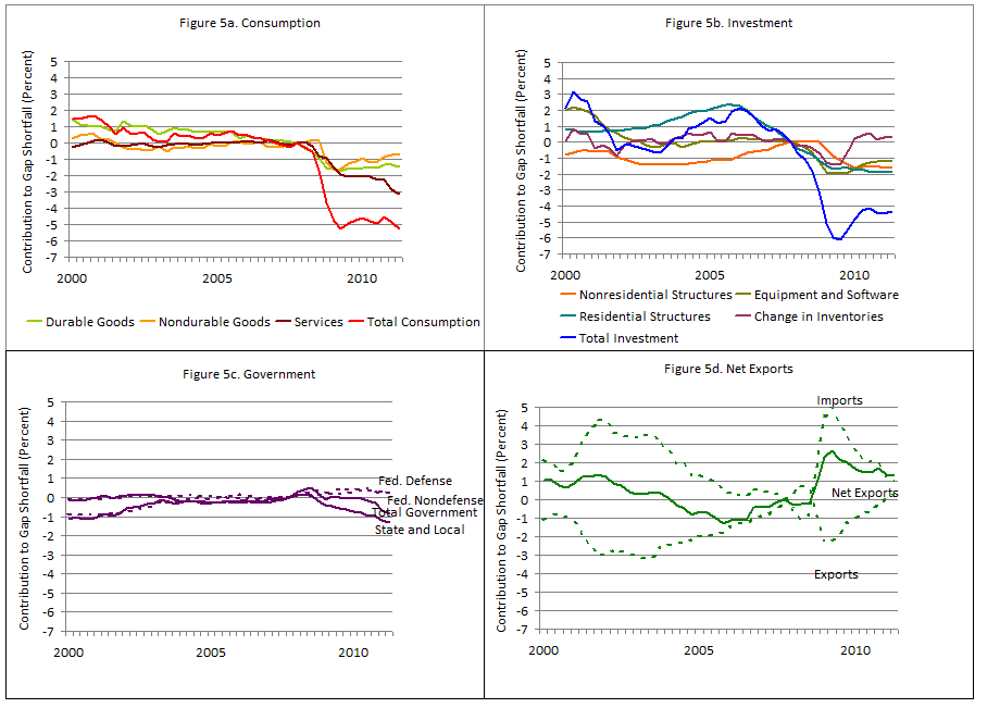
Four graphs in the addendum (see Figures 5a-5d below) show the subcomponents of the four main types of spending. The surprising result that by far the biggest part of the consumption shortfall is provided by services, which has more than twice the shortfall of durable goods. Over the past two quarters the consumer-services shortfall has become even larger. The services and durables gaps were positive for the entire period between 2000 and 2006, indicating that easy credit and cash-out refinancing were used for consumer services, not just to finance consumer durables.
Figure 4. Components of gap shortfall, 2000:Q1-2011:Q2
In contrast to the overall consumption shortfall – which continues to be as negative as in early 2009 – the total investment shortfall is somewhat smaller now. Surprisingly the current shortfall for nonresidential construction is almost as large as for residential construction. This occurs because much of the collapse of residential construction had already occurred between 2006:Q1 and 2007:Q4.
Figure 5c (below) decomposes government spending into state and local government spending, federal military, and federal nonmilitary spending on goods and services. Transfer payments, including unemployment compensation and social security payments, are by definition excluded from GDP. Total government spending’s contribution to the output gap was positive in 2008, neutral in 2009, and has become increasingly negative (i.e., contributing to the overall shortfall in total GDP) since early 2010. The small positive contribution of the two federal government components has been more than cancelled by declining state and local spending.
Net exports (Figure 5d below) have helped to offset the shortfall in the other spending components. In 2011:Q2 exports returned to the same ratio of potential GDP as in 2007:Q4, i.e., the total of real exports in the past 3.5 years has grown as much as potential real GDP (that is, by 9%). Imports, which are a subtraction from real GDP, have not recovered to their ratio to natural real GDP and thus have prevented the total output gap from being larger than it is. Without the contribution of the decreased level of imports, the total output gap would have been -10.2 instead of -9.2%.
Translating lost spending into lost jobs
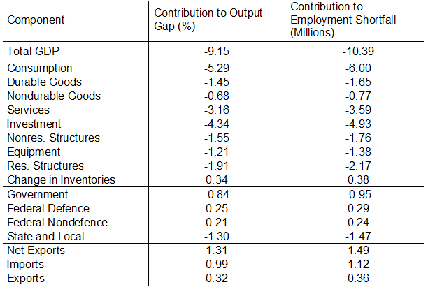
Table 1 lists the major components of spending and the subcomponents and displays the percentage shortfalls already displayed in Figures 4 and 5. Then we use the shares of each subcomponent in the total output shortfall to calculate the jobs shortfall for each subcomponent. Notice that this method treats all components of spending as equally labour-intensive, an acceptable approximation for this exercise. It includes in the jobs shortfall attributable to, say, residential structures, not just the construction jobs in the residential industry but all the jobs involved in raw materials and intermediate inputs to that industry, including lost jobs in providing lumber, nails, tools and equipment, heating and cooling equipment, built-in appliances, and more.
The shortfall of consumer-services spending is the largest subcomponent; it translates into 3.59 million missing jobs.The overall simulated job shortage would have been 11.88 million but for the helpful performance of net exports. It’s positive contribution brings the figure to a smaller but still unfortunate 10.39 million.
Next come the 2.17 million lost jobs in residential construction (on top of those lost between 2006:Q1 and 2007:Q4),
the 1.76 million in nonresidential structures,
1.65 million in consumer durables,
1.47 million in state and local government, and
1.38 million in equipment and software.
Table 1. Contribution of GDP components to output gap and employment shortfall, 2011:Q2
Conclusion
A change in labour market dynamics accounts for about 3 million of the over 10 million missing jobs in mid-2011. This shift can be traced to weakness of labour and growing assertiveness of management. But even with the labour-market institutions of 1955 through 1985, the weakness of aggregate demand in the recession and recovery would have cost roughly 7 million jobs instead of the 10 million jobs that are actually missing compared to normal economic conditions such as occurred in 2007.
The recession itself is usually and correctly traced to the collapse of the housing bubble and the post-Lehman financial panic. But the recovery has been unusually weak, completely unlike the economy’s rapid bounce-back in 1983-84, and this requires an explanation as well. The best place to start is the double hangover approach, which explains not just the collapse of residential structures investment but also the continued and growing weakness in consumer spending. Perhaps the most surprising result of this essay is that the spending component responsible for the largest share of the missing jobs is not residential investment but consumer spending on services.
This is not the place to talk about remedies.
The spending decomposition shows that fiscal policy has failed in that the government spending sector has made the output gap shortfall worse, not better.
The double hangover theory helps to explain why monetary policy is impotent, no matter how much “Quantitative Easing” is attempted.
Authors including Hall (2011) focus on the zero lower bound as the crux of the Fed’s problem and ignore the complementary problem of low interest-insensitivity of consumers who are trying to pay off old debt instead of taking on new debt.
The failure of consumer and investment spending to respond to an ever-lower 10-year government bond rate, which fell below 2.3% this past week, demonstrates that the problem is an “IS” curve that is very steep if not vertical at an output level far below that necessary to generate a normal level of employment. The vertical IS curve is just as relevant for understanding today’s economy as that of the 1930s, and it plays an essential role in the twelfth edition of my macro textbook (2012) in explaining why monetary policy may at times be impotent, just as it did in the first edition more than three decades ago.
Addendum: Details on the aggregate demand shortfall (click to enlarge)

No comments:
Post a Comment